Ihr Warenkorb
Total
0.00
Continue Shopping
Sustainability and unmistakable aesthetics - colors made from natural pigments
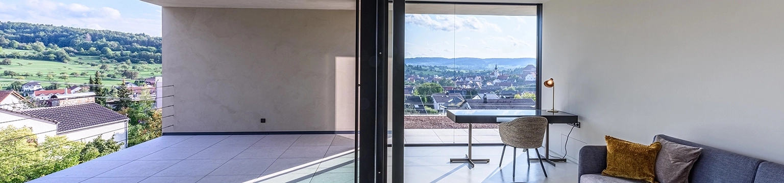
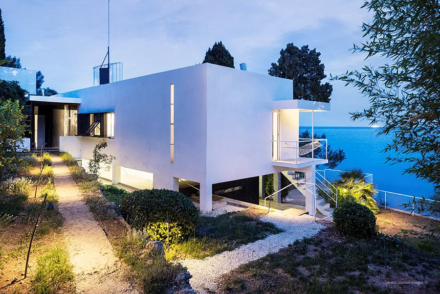
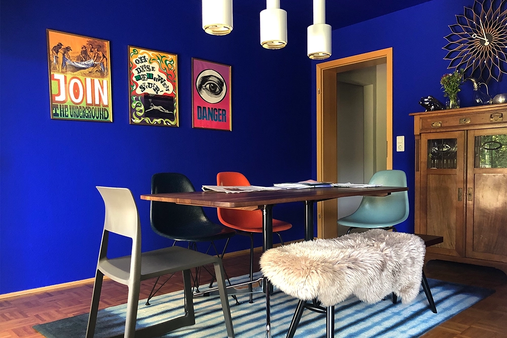
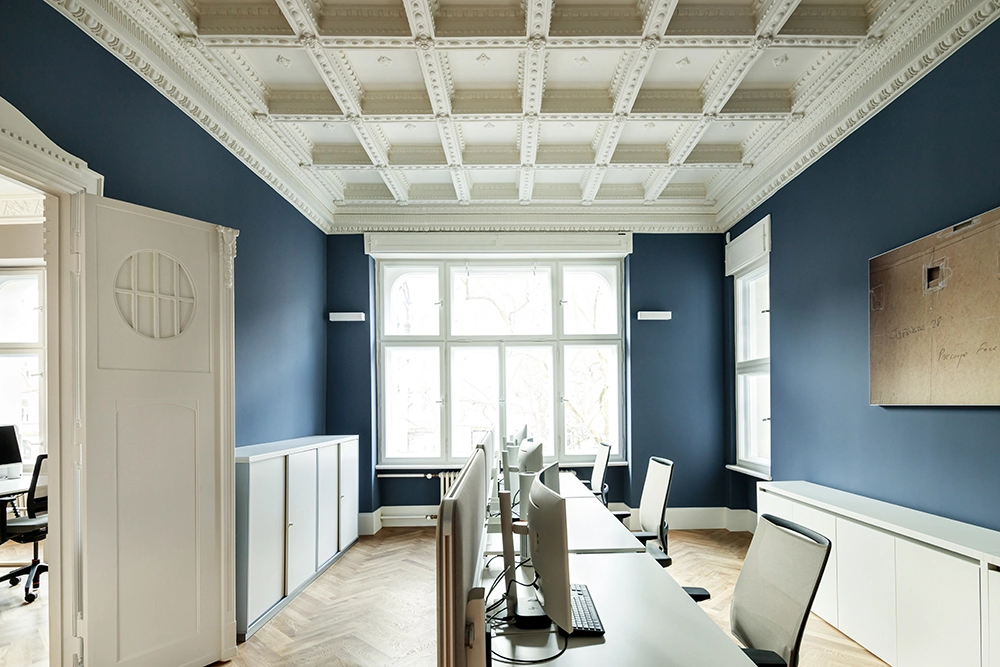
kt.COLOR is a Swiss manufacturer that produces sustainable, harmonious and exclusive colors from natural pigments. Founded in 1998 by Dr. Katrin Trautwein, the company combines scientific expertise with a deep passion for color culture and craftsmanship. The color manufacturer kt.COLOR is particularly well-known for its unique colors made from rare and exclusive pigments, which create an unmistakable aesthetic in architecture and interior design. Each color offers an extraordinary depth of color, a particularly intense luminosity and impresses with the highest ecological standards. The kt.COLOR range includes exclusive colors with cultural heritage, including the famous colors in Eileen Gray's House by the Sea E.1027 or the original Swiss color Bernese Sandstone.
kt.COLOR is a Swiss manufacturer that produces sustainable, harmonious and exclusive colors from natural pigments. Founded in 1998 by Dr. Katrin Trautwein, the company combines scientific expertise with a deep passion for color culture and craftsmanship. The color manufacturer kt.COLOR is particularly well-known for its unique colors made from rare and exclusive pigments, which create an unmistakable aesthetic in architecture and interior design. Each color offers an extraordinary depth of color, a particularly intense luminosity and impresses with the highest ecological standards. The kt.COLOR range includes exclusive colors with cultural heritage, including the famous colors in Eileen Gray's House by the Sea E.1027 or the original Swiss color Bernese Sandstone.
kt.COLOR is a Swiss manufacturer that produces sustainable, harmonious and exclusive colors from natural pigments. Founded in 1998 by Dr. Katrin Trautwein, the company combines scientific expertise with a deep passion for color culture and craftsmanship. The color manufacturer kt.COLOR is particularly well-known for its unique colors made from rare and exclusive pigments, which create an unmistakable aesthetic in architecture and interior design. Each color offers an extraordinary depth of color, a particularly intense luminosity and impresses with the highest ecological standards. The kt.COLOR range includes exclusive colors with cultural heritage, including the famous colors in Eileen Gray's House by the Sea E.1027 or the original Swiss color Bernese Sandstone.
180 exclusive colors, each with its own story
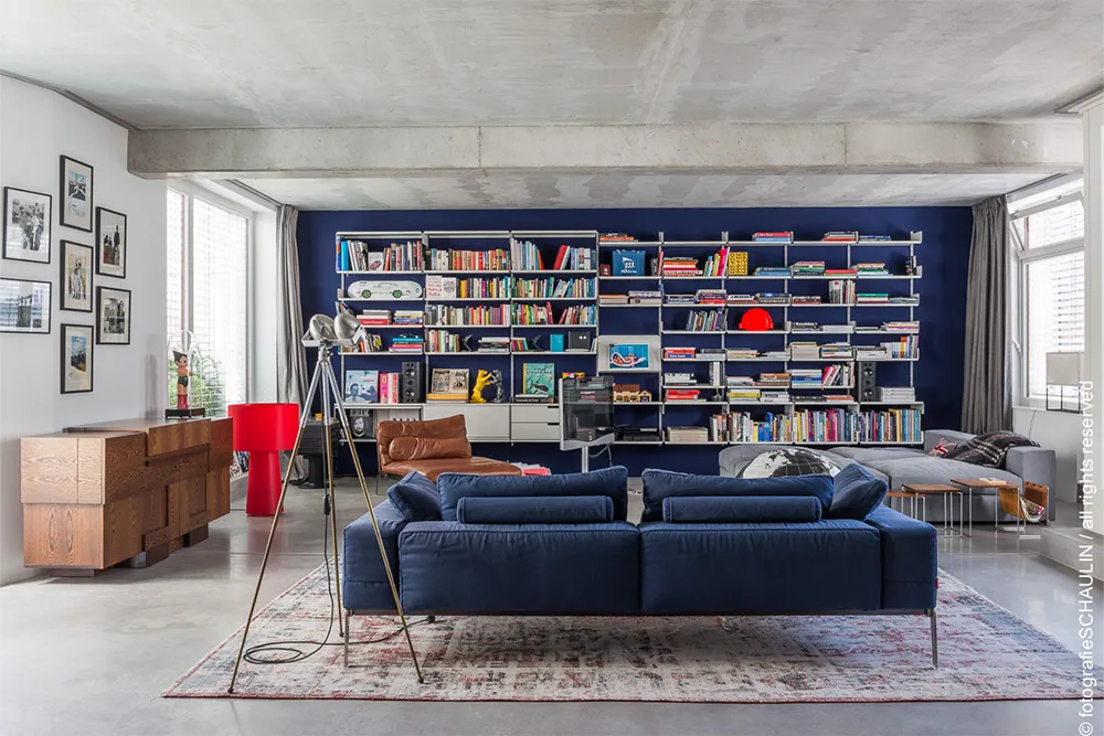
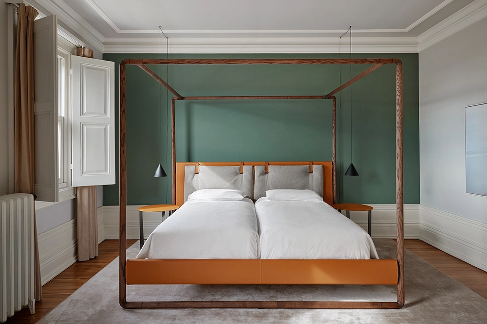
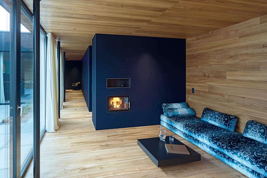
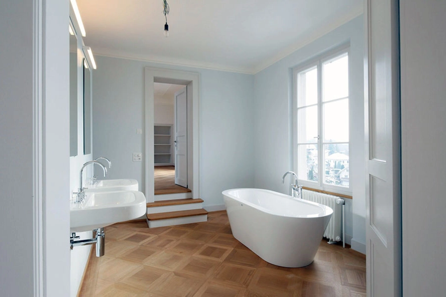
kt.COLOR offers 180 exclusive colors that are handmade from natural and mineral pigments. Each color tells its own story - inspired by Eileen Gray and Le Corbusier, architecture and design classics. Our collection of 180 highly pigmented colors gives rooms an unmistakable aesthetic and extraordinary depth of color. You will find 180 colors with character, handmade in Switzerland.
180 exclusive colors, each with its own story
kt.COLOR offers 180 exclusive colors that are handmade from natural and mineral pigments. Each color tells its own story - inspired by Eileen Gray and Le Corbusier, architecture and design classics. Our collection of 180 highly pigmented colors gives rooms an unmistakable aesthetic and extraordinary depth of color. You will find 180 colors with character, handmade in Switzerland.
Customer testimonials
“It worked wonderfully and the colors really make us happy every moment, we are really happy to have chosen the colors and to have chosen kt.COLOR colors at all! The painting work was done perfectly! I no longer understand why most apartments only have white walls! Iren Wohlgensinger, January 8, 2025.”
“The event gave me new perspectives - thank you very much. The individual focal points of the speakers were didactically convincing; these encounters with color always opened up new perspectives for the audience; color as a material, color in interplay with light, color as a sensual experience... Walter F., October 2024”.