Ihr Warenkorb
Total
0.00
Continue Shopping
Sustainability and unmistakable aesthetics - colors made from natural pigments
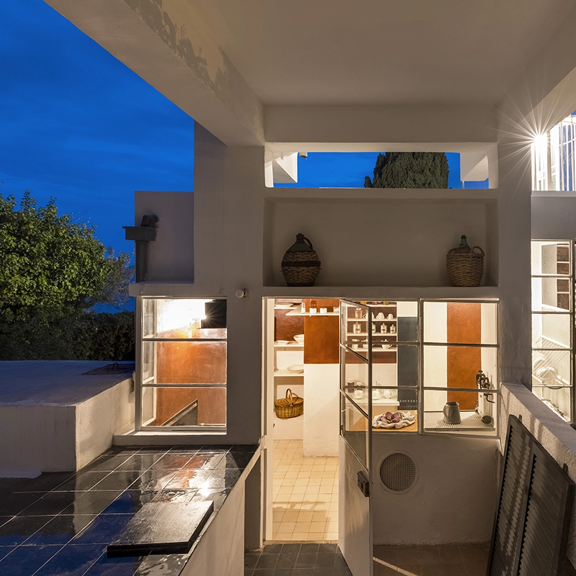
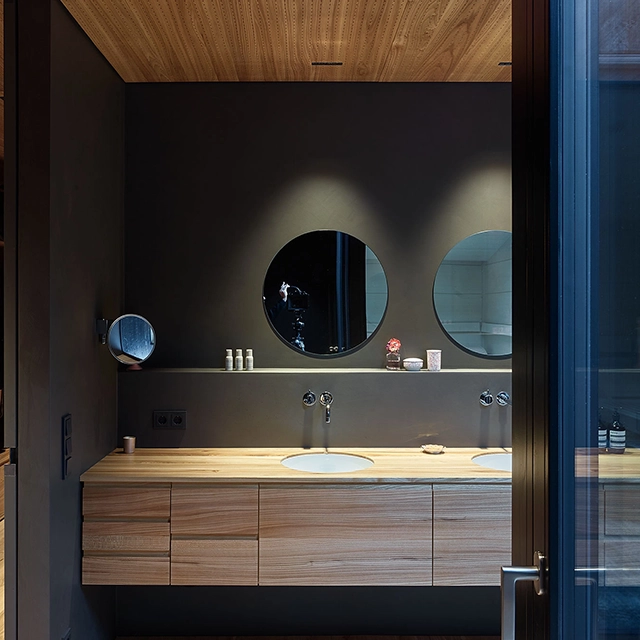
kt.COLOR is a Swiss manufacturer that produces sustainable, harmonious and exclusive colors from natural pigments. Founded in 1998 by Dr. Katrin Trautwein, the company combines scientific expertise with a deep passion for color culture and craftsmanship. The color manufacturer kt.COLOR is particularly well-known for its unique colors made from rare and exclusive pigments, which create an unmistakable aesthetic in architecture and interior design. Each color offers an extraordinary depth of color, a particularly intense luminosity and impresses with the highest ecological standards. The kt.COLOR range includes exclusive colors with cultural heritage, including the famous colors in Eileen Gray's House by the Sea E.1027 or the original Swiss color Bernese Sandstone.
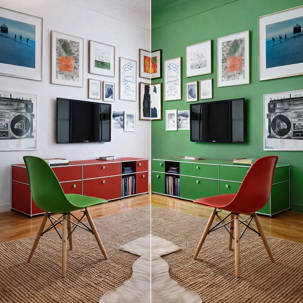
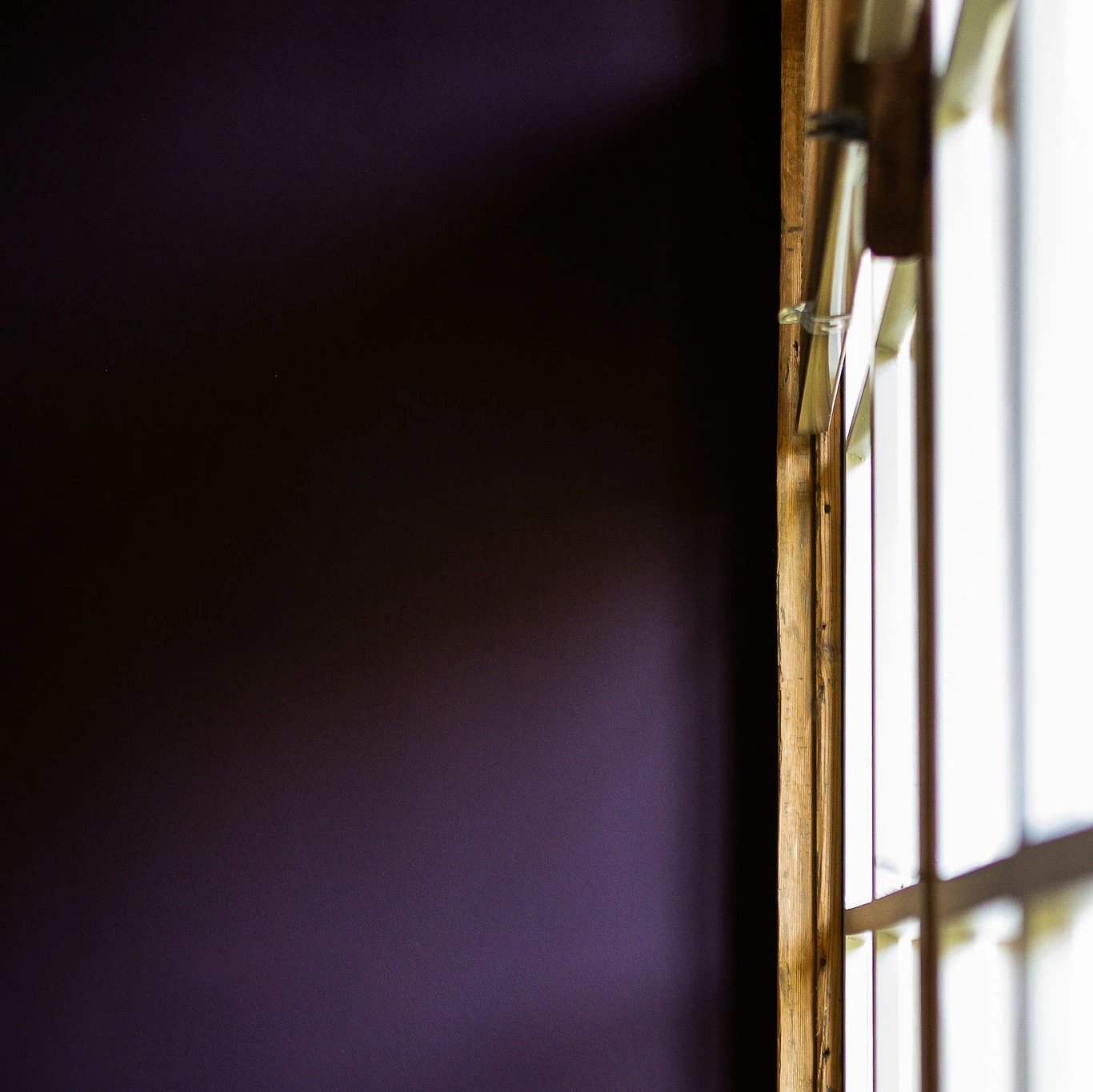
Rot und Grün
Rot dominant, Grün natürlich? Zu einfach. Der Beitrag zeigt, warum solche Klischees täuschen – und wie Rot und Grün im Zusammenspiel von Licht, Raum und Material tatsächlich wirken.
Farbe als Gabe
Farbe ist ein Geschenk der Natur. Sie verbindet uns emotional mit der Umwelt und der Architektur. Farbgestaltung ist keine Dekoration, sondern macht Raum, Konzept und Material sichtbar. Wie gelingt sie uns am besten?
Masterclass Light Color Architecture
Within reach: Convincing color concepts. Visual acuity. Inspiring presentations. Conceptual clarity. Light and color determine the human response to architectural space. Enroll in the Masterclass led by Swiss color researcher Dr. Katrin Trautwein to discover a new color logic based on cutting-edge perception research.
Natürliche Pigmente
Natürliche Pigmente sind subtil und harmonisch, zuverlässig, nachhaltig und zeitlos. Sie erleben ein Comeback im Luxusdesign, denn sie verleihen der Architektur eine unvergesslich schöne Ausstrahlung.
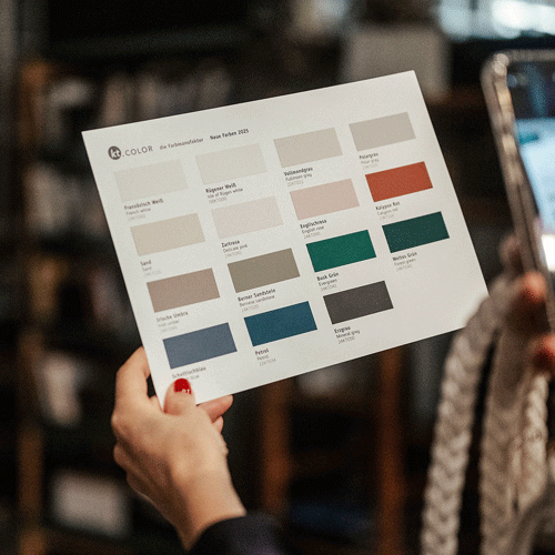
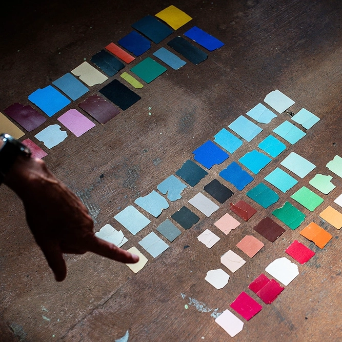
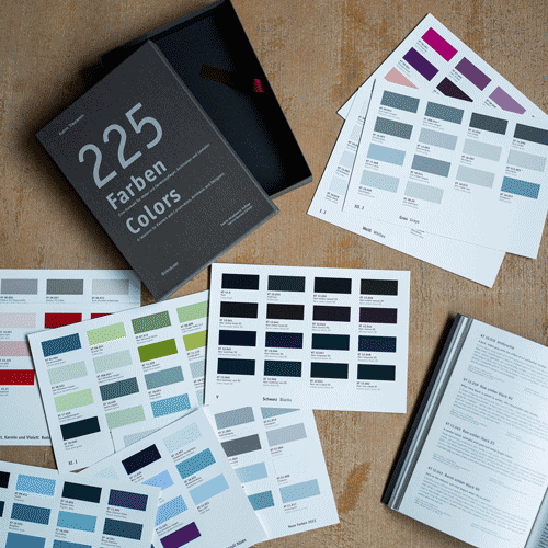
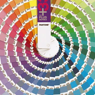
Sechzehn neue Farben
In diesem Bericht beschreiben wir 16 neue Farben. Hergestellt aus unserem Bestand an natürlichen Erdfarben und wertvollen Pigmenten, erfüllt jede eine bestimmte räumliche Funktion mit Anmut und Schönheit.
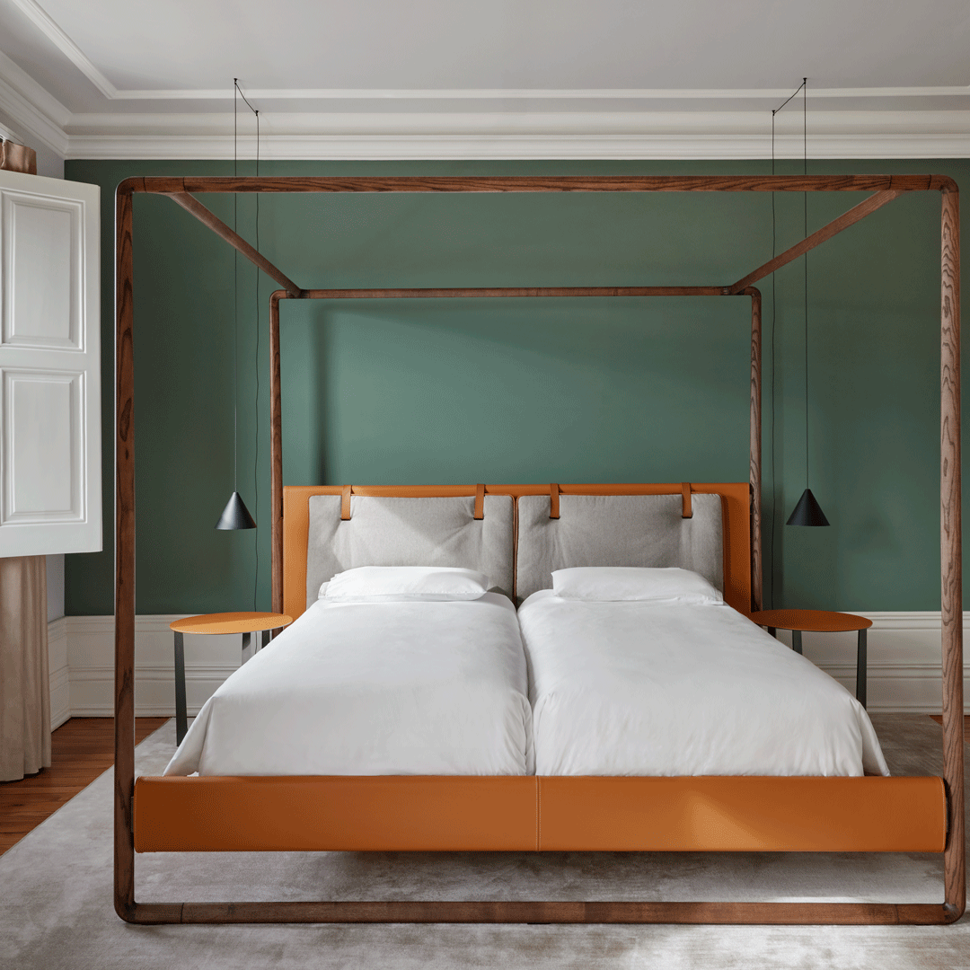
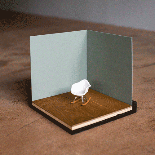
Farbkonzepte: Vier Anregungen
Ein Bericht über Farbkonzepte. Gute Farbkonzepte erfüllen vier Voraussetzungen damit sie die architektonische Idee unterstützen und physiologisch wohltuend, ökologisch nachhaltig und individuell sind.
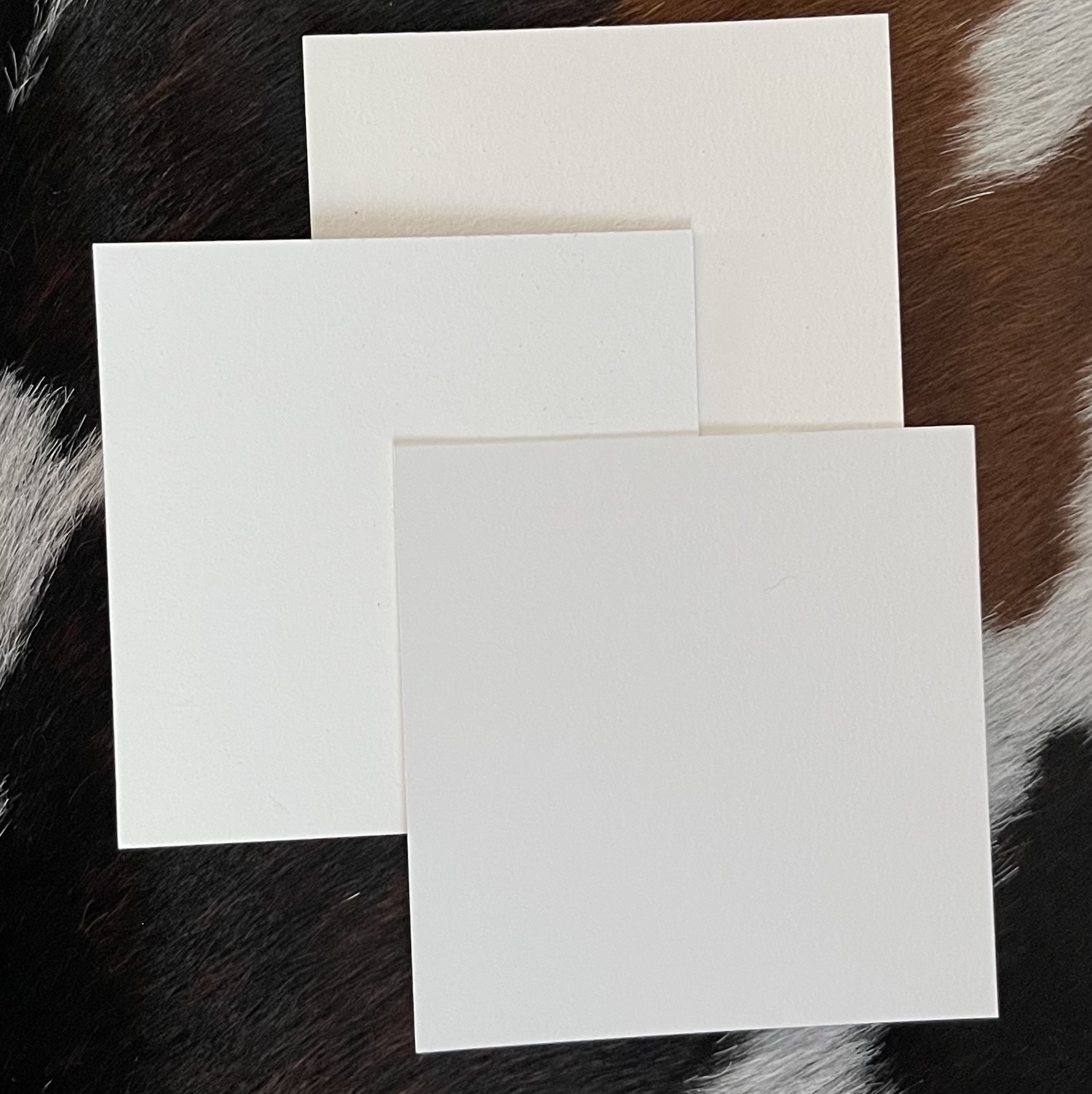
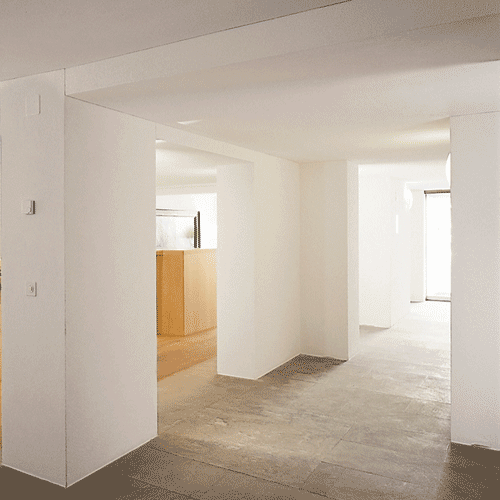
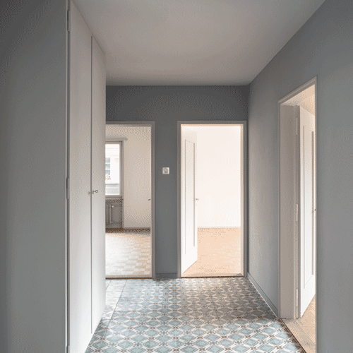
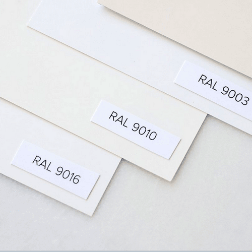
Farbberatung: Welches Weiß?
Weiß ist die wichtigste Farbe für die Atmosphäre im Raum. Es gibt kein neutrales Weiß und viele Ratschläge sind widersprüchlich. Mit diesen Tipps finden Sie das schönste, ökologisch beste Weiß.
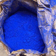
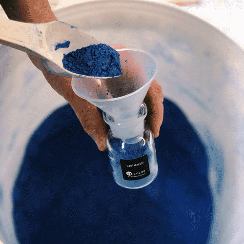
Ultramarin - tief und kostbar
Eine kostbare Farbe, tiefgründig in ihrer Bedeutung und magisch in ihrer Wirkung auf Mensch und im Raum: Ultramarin hat seit jeher den Status einer ganz besonderen Farbe. Warum das so ist, lesen Sie hier.
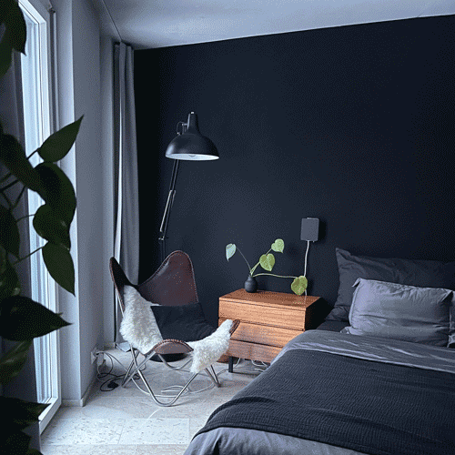
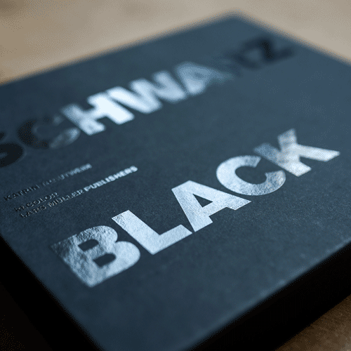
Wie wirkt schwarz?
Es ist viel leichter, sich eine grüne Wandfläche vorzustellen als eine schwarze! Oft wird gesagt, dass eine schwarze Wand zu dunkel sei. Sie drücke auf den Raum. Sind diese Aussagen richtig?
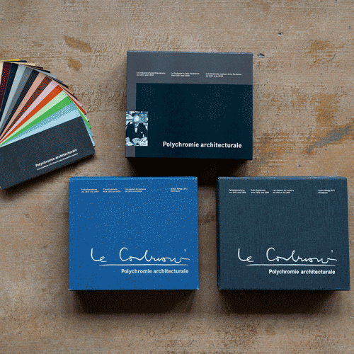
Eine exzellente Reportage
Eine Reportage stellt auf sieben Seiten unsere Arbeit als Schweizer Manufaktur vor. Sie erfahren, wie wir uns gegen große Firmen behaupten und lesen Katrin Trautweins Tipps für die Raumgestaltung.
Farbe und Echtheit
Unser Sehsinn ist Materialexperte. Imitationen werden mit Mißtrauen belegt. Die materielle Echtheit der Oberflächen im Raum ist für unsere emotionale Beziehung zur Architektur entscheidend.

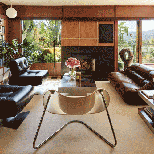
Farbe und Emotion
Braun wirke attraktiv, denn man denke an Schokolade, Kakao, Zimt, Kaffee, Nüsse und Krustenbrot. Die Annahme ist, dass eine Farbe Gefühle auslöst. Was ist aber mit dem Braun der Kakerlake?
Wie Farben wirklich wirken
Wie subjektiv ist Farbe? Ist Weiß neutral? Macht Rot aggressiv? Diese Aussagen sind wissenschaftlich nicht belegt und die Fragen grundsätzlich falsch gestellt. Erfahren Sie, wie Farben wirklich wirken.
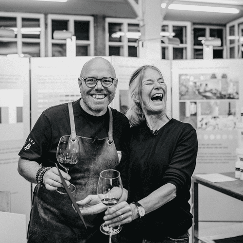
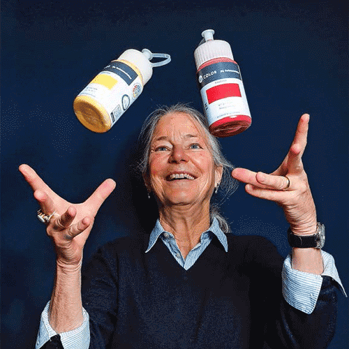
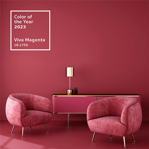
Zum Jahresende 2023
Sie erfahren was 2023 die zwei beliebtesten Farben waren - eine bunte, eine weiß. Außerdem welche Qualitäten Farbe und Wein gemeinsam haben und was mich als Farbforscherin 2023 am meisten bewegte.
Geschenke für Architekten
Drei inspirierende Geschenke für Architekt:innen, Designer:innen, Raumplaner:innen und Studierende. Handgemachte Farbmuster erleichtern ihnen die Farbenwahl und Kombinationen gelingen immer.
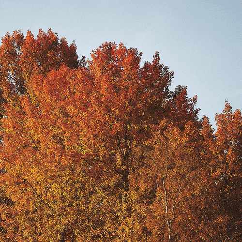
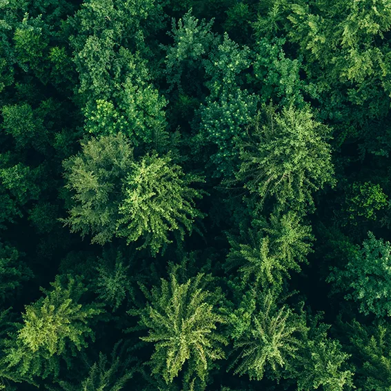
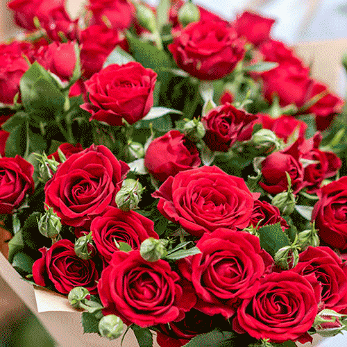
Farbe und die Jahreszeit
Die Blätter sind zu wunderschönen Farbtupfern der Jahreszeiten geworden. Die Farben verbinden uns mit dem Rhythmus der Tages- und der Jahreszeit. So innig sind wir mit den Farben im Umfeld verbunden!
Rügener Weiß
Die Kreide aus Rügen ist ein Wunderwerk der Natur. Wir nutzen die Heilerde als Pigment und stellen daraus Rügener Weiß her, eine herbe, vollkommene Farbe ohne Gelbstich mit gestalterischen Vorteilen.
Masterclass Light Color Architecture
Within reach: Convincing color concepts. Visual acuity. Inspiring presentations. Conceptual clarity. Light and color determine the human response to architectural space. Enroll in the Masterclass led by Swiss color researcher Dr. Katrin Trautwein to discover a new color logic based on cutting-edge perception research.
Customer testimonials
“It worked wonderfully and the colors really make us happy every moment, we are really happy to have chosen the colors and to have chosen kt.COLOR colors at all! The painting work was done perfectly! I no longer understand why most apartments only have white walls! Iren Wohlgensinger, January 8, 2025.”
“The event gave me new perspectives - thank you very much. The individual focal points of the speakers were didactically convincing; these encounters with color always opened up new perspectives for the audience; color as a material, color in interplay with light, color as a sensual experience... Walter F., October 2024”.