Ihr Warenkorb
Total
0.00
Continue Shopping

Color Concepts for Living Rooms
Living rooms are places for conversation, relaxation, and spending time with family and friends. Successful color concepts create an atmosphere where people, artworks, and personal collections naturally become the focus. Colors made from natural umber pigments, other soft earth pigments, and velvety matte off-whites provide a calm backdrop while responding beautifully to changing daylight.
The following living room color concepts were developed with ktCOLOR Architectural Colors for a wide range of architectural settings and design requirements. Each concept responds to daylight, room proportions, and surrounding materials to create balanced, timeless interiors. They demonstrate how natural and mineral pigments interact with light to give living rooms depth, calm, and a lasting architectural presence.
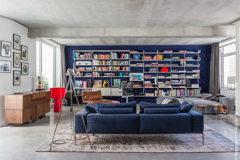
12KT046 Ultramarine Black 85. Foto ©Christian Schaulin
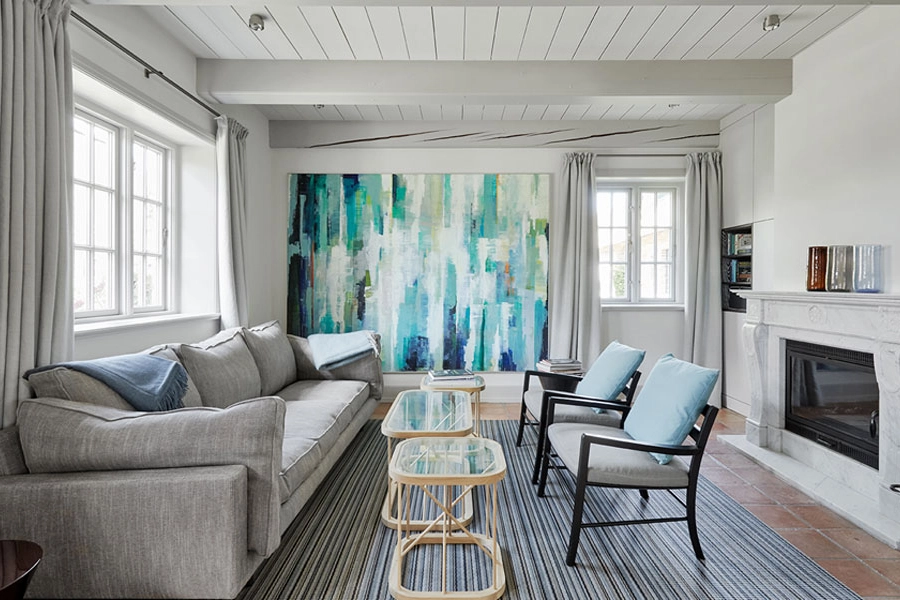
12KT099 Warm Natural White and 16KT002 Dusky Gray. Foto ©Nina Struve
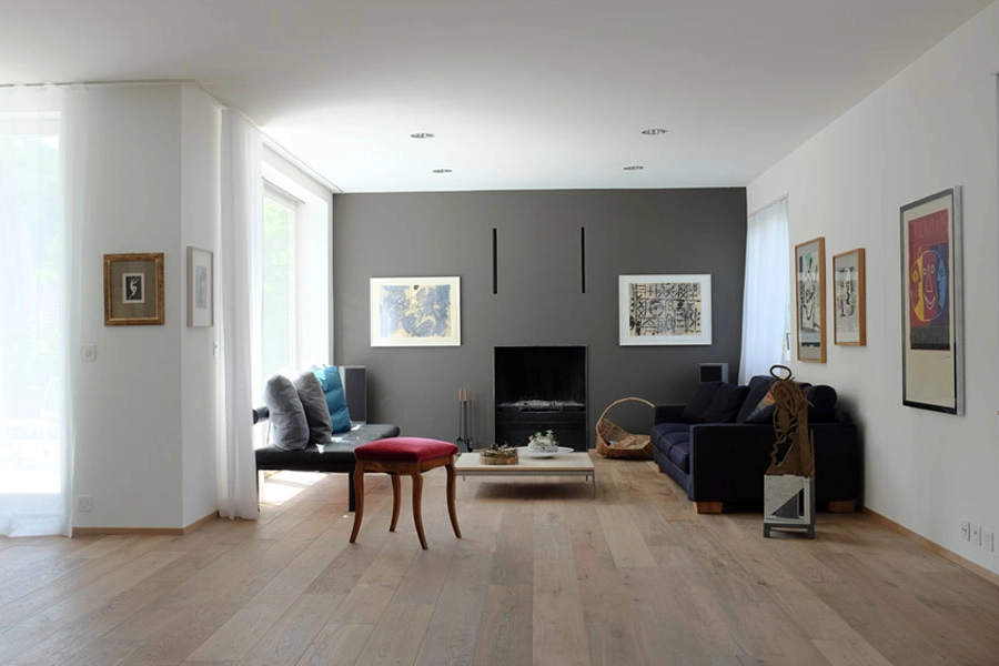
32KT140 Dark Native Umber. Foto Privatkundin ktCOLOR
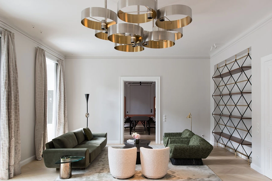
32KT004 Silver White and 32KT009 China Clay White. Foto ©Boo-Yeah

32KT004 Silver White and 18KT020 Spanish Green. Foto ©Grisard'architectur
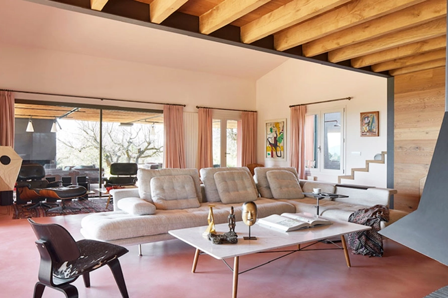
32KT132 Burnt Umber White. Foto ©Jordi Miralles
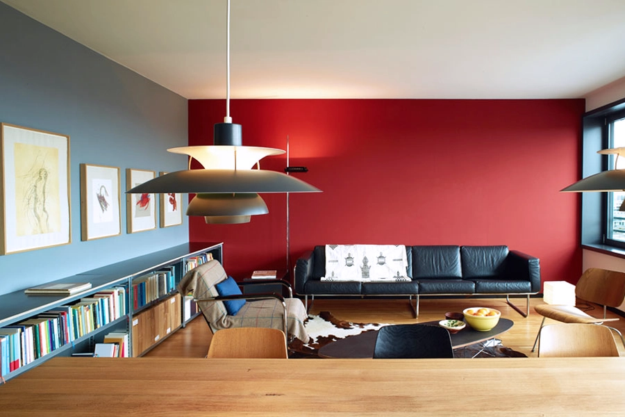
18KT027 Steely Gray and 32KT109 Pompeian Red. Foto ©Christoph Schuepp
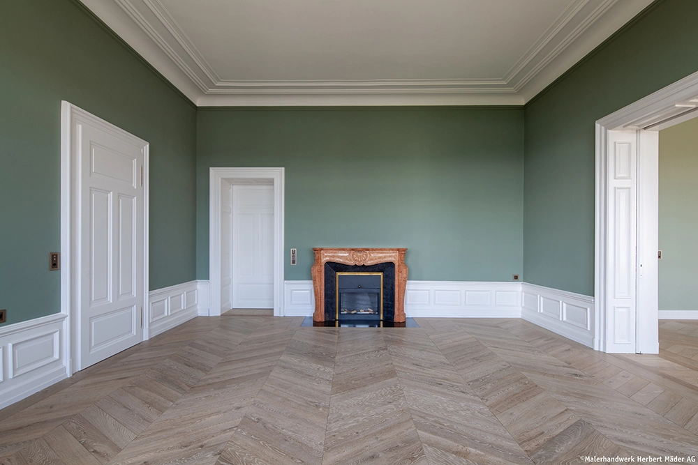
18KT021 Sage Green. Foto ©Malerhandwerk Herbert Mäder
Professional Tips for Living Room Color Design
1. Choose your main color carefully – usually a white, soft gray, or beige. There is no such thing as a neutral white. This color is the most dominant material in the room and shapes its mood more than any other.
2. Very bright whites suit rooms used mainly during the day. A more muted white works better for rooms also used in the evening under artificial light, since the brightest whites can cast gloomy shadows.
3. Which white? Match your white to the floor color, textiles, and lighting conditions.
4. Dark colors on individual surfaces add depth to a room.
5. Bold color accents bring energy to a room. Match them to the colors of the surrounding landscape and the available light.
6. Natural pigment colors, like those from ktCOLOR, create rooms that feel harmonious and authentic. Synthetic pigments and imitations simply cannot achieve this. The eye is not so easily fooled.
7. Choose the paint quality suited to the surface and its exposure: Emulsion for surfaces with light use; Silikat for mineral substrates indoors (0.5 mm grain) and for facades; Satinée for higher-traffic interiors, wood surfaces, and hospitality settings.
8. Think long-term! Timeless colors made from natural pigments, paired with a well-considered concept, outlast trends and support a lasting quality of living.
9. Ask our experts! We're happy to advise you individually and share our extensive experience with you.