Ihr Warenkorb
Total
0.00
Continue Shopping

Color Concepts for Dining Rooms
The dining room brings people together. It is where we share meals, conversations, celebrations, and everyday moments. Successful color concepts create a unified setting around the table instead of dividing the room with changing wall colors. A continuous wall color brings furniture, artwork, and architecture together while allowing the shared experience to take center stage.
The following dining room color concepts were developed with ktCOLOR Architectural Colors. They demonstrate how natural and mineral pigments create calm, cohesive spaces, while carefully placed accent colors give artwork or individual pieces of furniture depth and character. The result is a dining room where people enjoy gathering and lingering together.
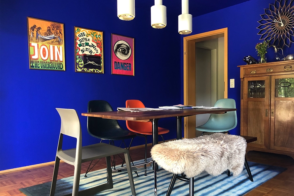
03KT001 Ultramarine Blue. ©Bärbel Heck, Studio Hans
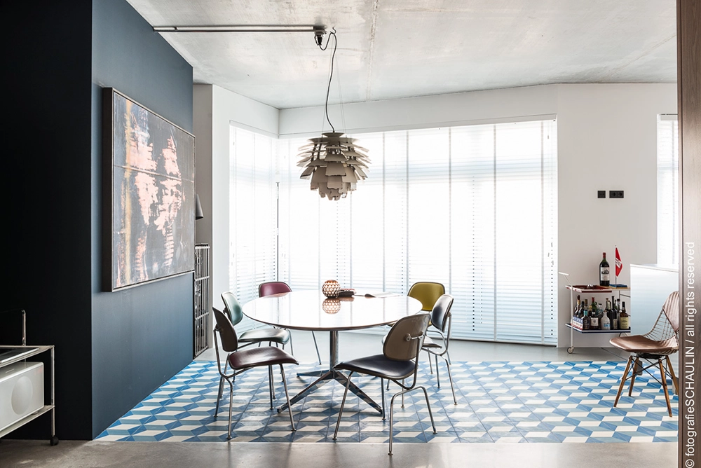
12KT048 Turquoise Black 85. Foto ©Christian Schaulin
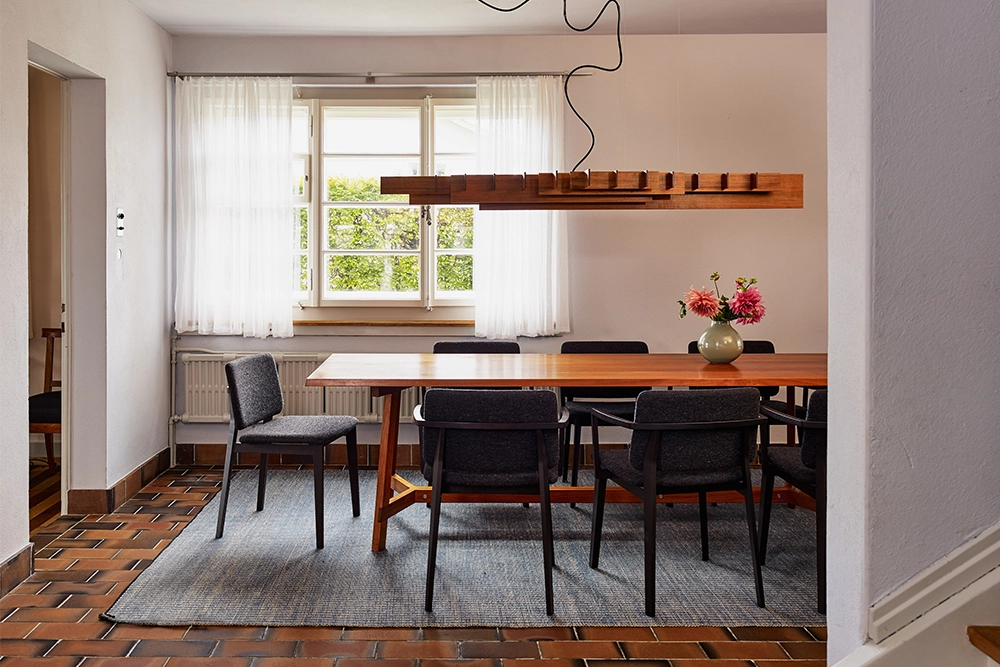
13KT095 Sky Gray. Foto ©Marc Niedermann
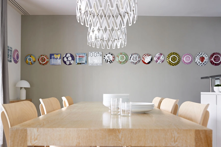
Champagne Silver, an exclusive ktCOLOR metallic color, applied for you by our Master Painters. Foto ©AMB
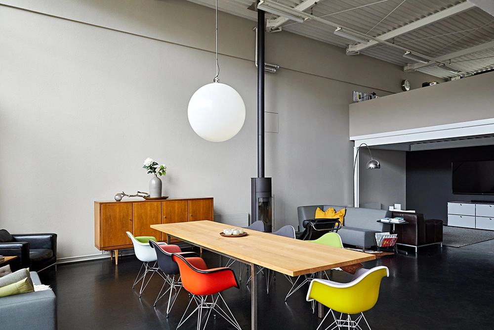
32KT142 Light Native Umber. Foto ©Roman Stalder GmbH
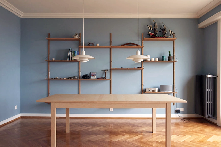
16KT006 Misty Blue. Foto ©Aureliano Ramella
Professional Tips for Choosing the Perfect Colors
1. Choose your main color carefully – usually a white, soft gray, or beige. There is no such thing as a neutral white. This color is the most dominant material in the room and shapes its mood more than any other.
2. Very bright whites suit rooms used mainly during the day. A more muted white works better for rooms also used in the evening under artificial light, since the brightest whites can cast gloomy shadows.
3. Which white? Match your white to the floor color, textiles, and lighting conditions.
4. Dark colors on individual surfaces add depth to a room.
5. Bold color accents bring energy to a room. Match them to the colors of the surrounding landscape and the available light.
6. Natural pigment colors, like those from ktCOLOR, create rooms that feel harmonious and authentic. Synthetic pigments and imitations simply cannot achieve this. The eye is not so easily fooled.
7. Choose the paint quality suited to the surface and its exposure: Emulsion for surfaces with light use; Silikat for mineral substrates indoors (0.5 mm grain) and for facades; Satinée for higher-traffic interiors, wood surfaces, and hospitality settings.
8. Think long-term! Timeless colors made from natural pigments, paired with a well-considered concept, outlast trends and support a lasting quality of living.
9. Ask our experts! We're happy to advise you individually and share our extensive experience with you.