Are you in another country?
Please select your country so that the language is correct and prices appear in the correct currency.
Working with Color: Library of 400 Combinations


Expert Color Combinations
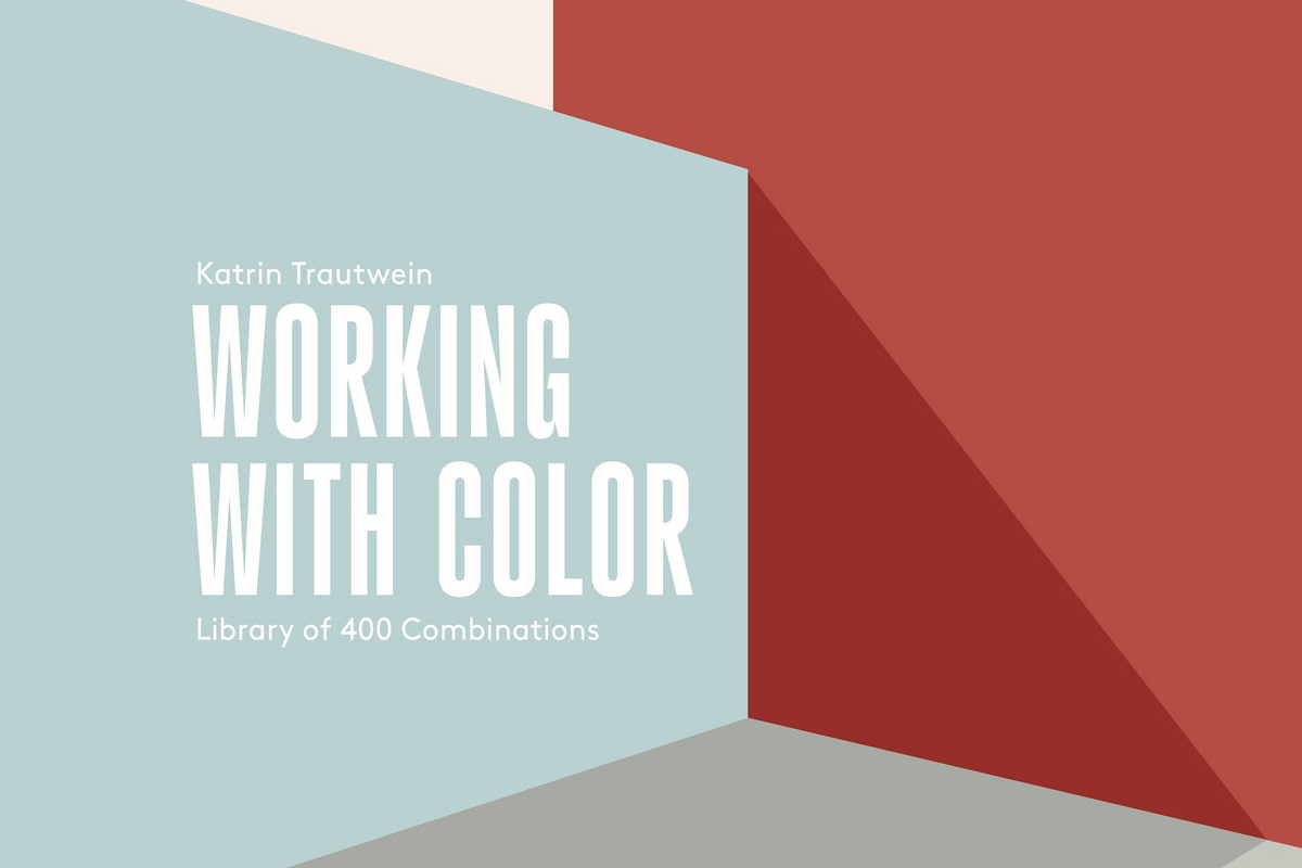
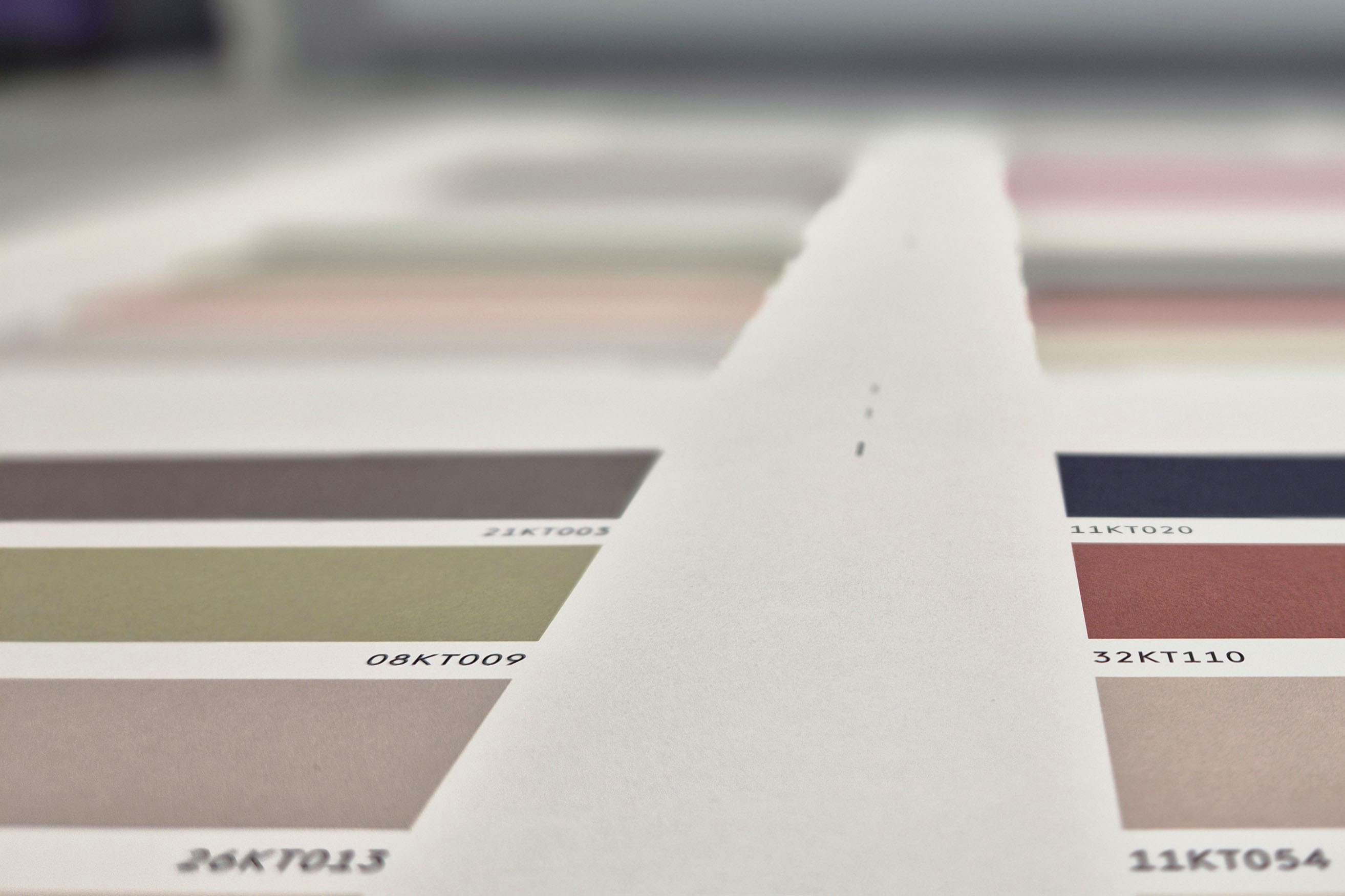
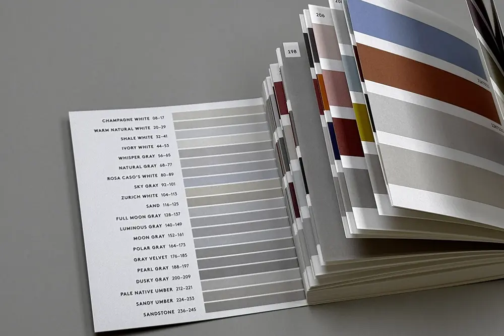
Our new library includes 400 color combinations guaranteed to suit any modern design. Compiled by color expert Katrin Trautwein, this library is the ultimate practical tool for architects, interior designers, architecture and design students, and anyone else looking for color design guidance. This chubby, lovable tome has 504 pages, an introduction in English (shown below), 400 high-quality color prints, and an index. It is the perfect desktop companion for anyone looking for new color combinations.
© Birkhäuser Publishers, 2025.
Expert Color Combinations
Working with Color: Library of 400 Combinations
€ 39.25
Available immediately
Introduction
Selecting the most beautiful and functional color combinations to complement flooring, architectural design, and client preferences is a complex challenge. How can one anticipate whether a combination will appear outdated or faded within just a few years? The prevalence of all-white architecture often reflects an attempt to bypass this dilemma. However, such designs frequently result in excessive light reflection on a purely functional level, while also reinforcing an unfortunate bias that equates whiteness with neutrality and superiority.
This color library serves as a practical tool, offering 400 balanced color combinations designed to harmonize with any architectural style. After selecting the main color in a concept—most often a shade of white or the color of the flooring—designers and clients can choose from a family of ten suitable combinations to form their preferred palette.
The colors featured in this book are the result of 25 years of dedicated research. By analyzing samples from historic sites and iconic buildings designed by visionaries such as Le Corbusier, Eileen Gray, the Bauhaus artists of Dessau, Bruno Taut, Lux Guyer, Verner Panton, and Hans Scharoun, kt.COLOR, the artisan paint company I founded, developed a palette of 225 architecturally useful colors rooted in a deep respect for natural pigments. The palette reflects a broad spectrum of architectural philosophies on beauty.
The prints in this book are high-quality CMYK reproductions of 165 of these paint colors. Several whites are included, as white is the most important color in most concepts. However, only whites darker than the color of the paper could be printed. By using chlorine-free, natural paper, we were able to include French White (which is identical in tone to the paper) as a default main color for the concepts.
While the color prints on this paper provide an excellent starting point for color consultations, they cannot fully convey the richness, depth, spatial effect, and tactile appeal of the original pigments. Final color selections should always be made using authentic color samples crafted from the appropriate pigments. Such samples can be ordered online at ktcolor.com, with details available in the index at the back of the book.
How to Use This Color Library
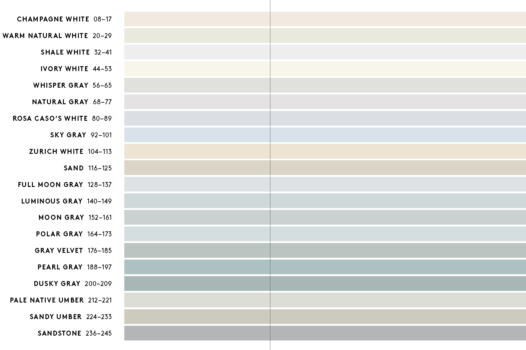
Each of the 400 combinations consists of: 1. The default white of the natural paper, which corresponds to 24KT000 French White. 2. The color of the flooring or a darker white, in case French White is too bright for the concept. 3. A deeper achromatic color, typically a gray or umber. 4. Two additional complementary colors, including a range of chromatic colors and several blacks. Each flooring color or darker white, which is the main color, is shown with ten different concepts. While flipping through the pages can offer inspiration, I recommend starting with the main color—either your preferred white, or a shade closest to the flooring. These colors structure the book and are placed at the bottom of each page. Ten concepts are dedicated to each of these main colors. The main colors are arranged according to relative brightness levels from the lightest printable white to black. The final color concepts represent wood tones, from very light ochre to dark stained woods. These concepts are just as useful for wood constructions as they are for wood flooring. The underlying logic of these selections is based on my research into the multi-faceted relationships between light, color, emotions, spatial navigation, and perception. This color library was created for designers and homeowners who wish to apply the principles of spatial perception to their projects effectively—without having to study the theory. This book owes its existence to the colors created by the talented kt.COLOR team. Its beautiful design was created by Lena Mahr, and Katharina Kulke, my editor at Birkhäuser Publishers, and my husband Klaus contributed valuable insights and corrections. I extend my deepest gratitude to all of you. Creating this book was a pleasure, and I hope that its good spirit inspires those who use it. Katrin TrautweinIntroduction
Selecting the most beautiful and functional color combinations to complement flooring, architectural design, and client preferences is a complex challenge. How can one anticipate whether a combination will appear outdated or faded within just a few years? The prevalence of all-white architecture often reflects an attempt to bypass this dilemma. However, such designs frequently result in excessive light reflection on a purely functional level, while also reinforcing an unfortunate bias that equates whiteness with neutrality and superiority.
This color library serves as a practical tool, offering 400 balanced color combinations designed to harmonize with any architectural style. After selecting the main color in a concept—most often a shade of white or the color of the flooring—designers and clients can choose from a family of ten suitable combinations to form their preferred palette.
The colors featured in this book are the result of 25 years of dedicated research. By analyzing samples from historic sites and iconic buildings designed by visionaries such as Le Corbusier, Eileen Gray, the Bauhaus artists of Dessau, Bruno Taut, Lux Guyer, Verner Panton, and Hans Scharoun, kt.COLOR, the artisan paint company I founded, developed a palette of 225 architecturally useful colors rooted in a deep respect for natural pigments. The palette reflects a broad spectrum of architectural philosophies on beauty.
The prints in this book are high-quality CMYK reproductions of 165 of these paint colors. Several whites are included, as white is the most important color in most concepts. However, only whites darker than the color of the paper could be printed. By using chlorine-free, natural paper, we were able to include French White (which is identical in tone to the paper) as a default main color for the concepts.
While the color prints on this paper provide an excellent starting point for color consultations, they cannot fully convey the richness, depth, spatial effect, and tactile appeal of the original pigments. Final color selections should always be made using authentic color samples crafted from the appropriate pigments. Such samples can be ordered online at ktcolor.com, with details available in the index at the back of the book.
How to Use This Color Library
Each of the 400 combinations consists of: 1. The default white of the natural paper, which corresponds to 24KT000 French White. 2. The color of the flooring or a darker white, in case French White is too bright for the concept. 3. A deeper achromatic color, typically a gray or umber. 4. Two additional complementary colors, including a range of chromatic colors and several blacks. Each flooring color or darker white, which is the main color, is shown with ten different concepts. While flipping through the pages can offer inspiration, I recommend starting with the main color—either your preferred white, or a shade closest to the flooring. These colors structure the book and are placed at the bottom of each page. Ten concepts are dedicated to each of these main colors. The main colors are arranged according to relative brightness levels from the lightest printable white to black. The final color concepts represent wood tones, from very light ochre to dark stained woods. These concepts are just as useful for wood constructions as they are for wood flooring. The underlying logic of these selections is based on my research into the multi-faceted relationships between light, color, emotions, spatial navigation, and perception. This color library was created for designers and homeowners who wish to apply the principles of spatial perception to their projects effectively—without having to study the theory. This book owes its existence to the colors created by the talented kt.COLOR team. Its beautiful design was created by Lena Mahr, and Katharina Kulke, my editor at Birkhäuser Publishers, and my husband Klaus contributed valuable insights and corrections. I extend my deepest gratitude to all of you. Creating this book was a pleasure, and I hope that its good spirit inspires those who use it. Katrin Trautwein